Creating my logo
- kw4u19
- Jan 22, 2021
- 3 min read
My goal is to create a logo that is unique, memorable and presents the tones of my game. As my game is a serious game which will act as an educational tool, the logo should reflect that and be somewhat sharp and simple, with a strong font. However I would like to also present the more playful elements of my game through the logo, perhaps through the use of shape and colour.
To begin this process, I first looked at the logo's of other serious and environmental themed games. I found that the majority of these logos used smart, professional fonts and limited colour to show that they were games prioritising context over play. Most of game logo's used a combination of word marks and pictorial marks but still kept the imagery relatively simple and refined.
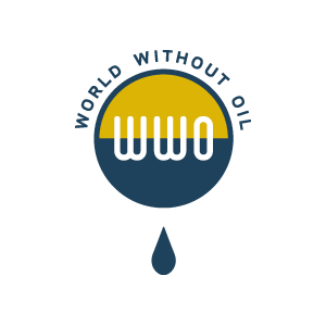
The one that I think draws the most attention is 'tiltfactor' for its bold use of colour and contrast between red, green and white. I think that this is a successful design. 'Recycle City's' logo is too detailed and the text does not contrast enough against the background showing how important colour contrast is when designing logos. I like that World Without Oil uses an interesting pictorial mark and playful font but I don't think it looks like a game. It could easily be perceived as any other business logo.


Analysing these logos was helpful in working out what works well and what doesn't and this will support my own logo design.
Below I have experimented with different fonts and word compositions. I decided that a combination of pictorial and word marks would be best to present a game idea that is both playful and purposed for education.
For my own logo, I first looked at some different fonts picking out the ones that stuck out to me most that also thought would be appropriate for the design. I also explored some ways I incorporate a planet pictorial mark to show that the game is about changing the fate of our world.

The earth pictorial is effective in suggesting the theme and purpose of the game so I decided i definitely wanted to include this in part of my design. I also thought that it would be best for the font to be thick and bold to represent the seriousness.
Next I started creating some concepts for the logo...
These designs below feature the circular shape I wanted to represent the planet but I think that they look too bunched up and the surrounding text is far too large. However I think the world "our" taking the shape of the earth works really well.

Keeping the world "our" as the shape of the planet, I experimented with moving around the other words but then it was harder to work out what the logo actually says. The colour combination was successful though.

Next, I tried putting the full game title into the shape of a globe. I like this composition the best so I experimented by changing the colour and including a background and decided it would be great for the letters of the title to symbolise the land and a blue background could be the sea. To include the themes of transformation and climate change in the log I added a gradient to the words that shows how the land will change as temperatures rise; drying out and losing its colour.

After deciding that the gradient title shaped like the earth was my favourite composition I lightened the blue background behind the text to increase the contrast and here we have my final logo for "Change our fate".


Comments